Wednesday, 28 November 2012
Sunday, 18 November 2012
Sound and Image project, Doppleganger.
Ok so to contrast the social situations that our doppleganger is going to encounter, we needed some ideas for shots that showed the isolation he surrounds himself with when he is alone...
“""These people were like shadows, one would meet in the
Underworld. I decided to express that feeling in my work, to convey my personal
expressions. I had to find a visual metaphor that would enable the viewer to
share my feelings as acutely as possible. That is what prompted me to try a long exposure
process.”
We agreed we liked the effect this gave, so I experimented with different exposures, see what shutter speed gave the best effect etc..
With this idea in mind, We needed locations and storyboards. I visited potential locations that could isolation our guy, spaces that he could think and realise what he's doing in a way. Also a viewer needs to see the contrast in his life to fully understand the story. So heres a few shots from different locations...
Firstly went to a maaaaasive reservoir, had a lot of eeriness about it and a lot of 'thinking space' as they say. Would want to revisit again to shoot with a wide angle lense to show the space, as well as catching the sunset for the aesthetic side of things.
Played around with the idea of his 'hidden identity', who's the real him..
Tried shots from the back, gives leeway for the narration to take over. Again also tried the long exposure effect which worked okay, definitely in need of a tripod though!

After I visited Beacon Hill, highest point in Leicestershire definitely felt the effect. freezing. Would have preferred to have got their earlier to have got a bit more light, but the silhouettes kinda worked.
Quite like the further away shot's to capture the whole scenery. Feel its a bit cheesy at the minute but could work?
Took a few looking over the city, quite liked the contrast of a lonely man looking over the 'hustle and bustle' of a city. Again, need a tripod!!!!
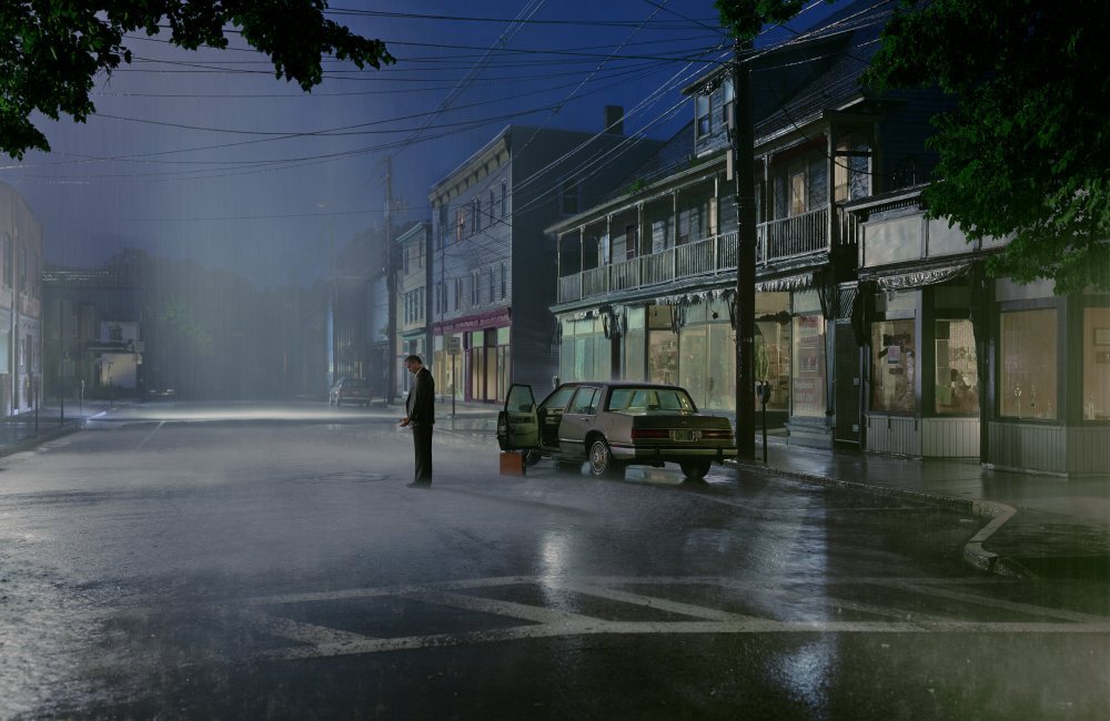
I must be having some sort of breakdown as I usually hate this man, but Gregory Crewdson's work actually inspired me. about time. The whole idea of creating an isolated scene, the lighting mainly, just the whole feel of his images I thought would be good to take some aspects from. Need to stop, questioning my sanity.
Did a quick little shot with some car headlights, worked surprisingly well and gave the effect I wanted. Just trying to give a sense of loneliness to the images..
I now have a new pet hate, British lamp-posts Not giving the right light I want, I hate modernism. Anyway, experimented with lights, silhouettes etc.
Not entirely sure why they're so red but that's the beauty of black and white monochrome.
So there's a few more test shots done, want to do some more in the city centre as it would create
that contrast between isolation and being
surrounded a lot more...
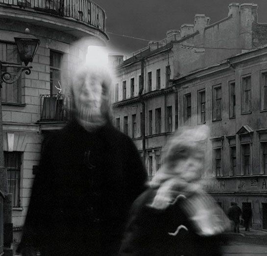
The first work that reminded me of what we wanted to achieve was Alexy Titarenko.
Titarenko was inspired to use such long exposures to
give this effect to show the vast amount of people in the environment, as well
as to show the insignificant and solitude sense of each person. He juxtaposes
some people with the other blurs to create a sense of solitude and isolation to
them.
We agreed we liked the effect this gave, so I experimented with different exposures, see what shutter speed gave the best effect etc..
With this idea in mind, We needed locations and storyboards. I visited potential locations that could isolation our guy, spaces that he could think and realise what he's doing in a way. Also a viewer needs to see the contrast in his life to fully understand the story. So heres a few shots from different locations...
Firstly went to a maaaaasive reservoir, had a lot of eeriness about it and a lot of 'thinking space' as they say. Would want to revisit again to shoot with a wide angle lense to show the space, as well as catching the sunset for the aesthetic side of things.
Played around with the idea of his 'hidden identity', who's the real him..
Tried shots from the back, gives leeway for the narration to take over. Again also tried the long exposure effect which worked okay, definitely in need of a tripod though!
After I visited Beacon Hill, highest point in Leicestershire definitely felt the effect. freezing. Would have preferred to have got their earlier to have got a bit more light, but the silhouettes kinda worked.
Quite like the further away shot's to capture the whole scenery. Feel its a bit cheesy at the minute but could work?
Took a few looking over the city, quite liked the contrast of a lonely man looking over the 'hustle and bustle' of a city. Again, need a tripod!!!!
I must be having some sort of breakdown as I usually hate this man, but Gregory Crewdson's work actually inspired me. about time. The whole idea of creating an isolated scene, the lighting mainly, just the whole feel of his images I thought would be good to take some aspects from. Need to stop, questioning my sanity.
Now obviously are images would have a more natural sense to them, but I took the idea of isolating with light and experimented with it...
Did a quick little shot with some car headlights, worked surprisingly well and gave the effect I wanted. Just trying to give a sense of loneliness to the images..
I now have a new pet hate, British lamp-posts Not giving the right light I want, I hate modernism. Anyway, experimented with lights, silhouettes etc.
Not entirely sure why they're so red but that's the beauty of black and white monochrome.
that contrast between isolation and being
surrounded a lot more...
Friday, 16 March 2012
The Genius of Moving Image: Part 2
What is the role of the cinematographer in film making?
The cinematographer is responsible for creating a consistent sense and look for a film. Working alongside the director, their role is to control the lighting, the mood, and creating images that help tell the story.
Why did director Roman Polanski insist on using hand held camera in the film Chinatown?
Roman Polanski used a hand held camera in 'Chinatown' to create a more intimate feel and to achieve more natural responses from the actors.
2. Pleasantville (1998). Again, the use of black and white against colour differentiates two universes. In Pleasantville, it is used to show the separation of morals in 1950's America. The bright, bold colours that the characters are injected into are metaphorically symbolising the rebellious teenagers of the 50's, influenced by sex, rock and roll and jazz.
The cinematographer is responsible for creating a consistent sense and look for a film. Working alongside the director, their role is to control the lighting, the mood, and creating images that help tell the story.
Why did director Roman Polanski insist on using hand held camera in the film Chinatown?
Roman Polanski used a hand held camera in 'Chinatown' to create a more intimate feel and to achieve more natural responses from the actors.
Name two films which use colour in a very symbolic way, and describe what they suggest.
1. The Wizard of Oz (1939). The use of juxtaposition between black and white and colour is used to show two different states of mind. At the start of the film we are introduced to the characters and setting in black and white film, showing reality and normality. It is only when Dorothy turns into a dream-like state that we are introduced to high-saturated colour. This symbolises the fantasy, idolized world in her mind.
In the film Raging Bull why was the fight scene filmed at different speeds?
Using different frame speeds in Raging Bull allowed the director to control the audience's emotions towards
the characters, for example the slow scenes, give a more dramatic feel.
Using different frame speeds in Raging Bull allowed the director to control the audience's emotions towards
the characters, for example the slow scenes, give a more dramatic feel.
Who is the cinematographer for the film Apocalypse Now, and what is his philosophy?
Vittorio Storaro was the cinematographer for Apocalypse Now. His philosophy is inspired by Johann Wolfgang's 'theory of colours', in which the theory is that different colours have different effects and influences on people and situations.
The Genius of Photography: Part 6
1. How many photographs are taken per year?
Approximately 80 billion images are taken per year.
2.What is Gregory Crewdsons modus operandi?
Crewdson's 'modus operandi' or mode of operation is to create a scene, very much like a movie set, in order to capture one single image. He captures a series of multiple exposures and digital combines them to make his final prints.
A fake photograph is something that has been constructed, invented or manipulated to give a different perspective and view to the subject matter. Joan Fontcuberta is a well known photographer who examines the truth in photography. The project Sputnik (1997) entailed Fontcuberta creating evidence and belief that an astronaut Ivan Istochnikov had crewed Soyuz 2 when in fact he had disappeared on the mission.
The agency Magnum was known as photographers "holy of holies". It was one of the most prestigious agencies and was founded by legendary photographers such as Henri Cartier Bresson and Robert Capa.
Lewis claims that Walls did not create photography, but brought it back into the 19th century where everything in an image was constructed for a reason, much like a painting.
8.Which famous photograph was taken by “Frank Mustard”?
Approximately 80 billion images are taken per year.
2.What is Gregory Crewdsons modus operandi?
Crewdson's 'modus operandi' or mode of operation is to create a scene, very much like a movie set, in order to capture one single image. He captures a series of multiple exposures and digital combines them to make his final prints.
3.Which prints command the highest price & what are they called?
The prints that achieve the highest price are the ones processed by the photographer themselves. The closer the process and the capturing of the image, the better.
4.What is a Fake photograph? Give an example and explain how & why it is fake.
5.Who is Li Zhensheng and what is he famous for?
Li Zhensheng was a solider turned photojournalist, who in the 1960's and 70's found himself reporting and documenting the Cultural Revolution.
6.What is the photographers “holy of holies”?
7.How does Ben Lewis see Jeff Walls photography?
8.Which famous photograph was taken by “Frank Mustard”?
Frank Mustard was a photographer who originally took the photography 'The River France'. Camille Silvy was the artist always credited for creating and manipulating the image.
Thursday, 15 March 2012
The Genius of Photography, Part 4
1.Why did Garry Winogrand take photographs?
To see what the world looked like photographed.
2.Why did “citizens evolve from blurs to solid flesh”?
At first, photographers could not capture movement in street photography because of the long exposure times. Gradually the technology improved and the previous blurs became solid flesh.
3.What was/is the “much misunderstood theory”?
The much misunderstood theory comes from Henri Carter Bressons theory of 'the decisive moment'.
4.Who was the godfather of street photography in the USA?
Gary Winogand was somewhat a 'pack leader' for street photographers. People were known to respond to his energy in which gave him revolutionary images.
5.Who was Paul Martin and what did he do?
Paul Martin was an British photographer. In 1896 in Great Yarmouth, he disguised a camera as a brown paper parcel. He captured images showing the other side of Victorian lifestyle, in that somehow the beach was a place they could forget that they were Victorian.
6.Who said “When I was growing up photographers were either nerds or pornographers”?
Edward Ruscha claimed that when he was growing up, photographers were either nerds or poronographers. People with cameras had no social value.
7.Why does William Eggleston photograph in colour?
Eggleston photographed in colour because he felt it gave a different perspective and content to his work.
8.What is William Eggleston about?
Eggleston is a man of few words, quoting that his work was 'at war with th obvious'. His images are 'democratic', and his use of bold, bright colour give a completely different structure to many other photographers work.
To see what the world looked like photographed.
2.Why did “citizens evolve from blurs to solid flesh”?
At first, photographers could not capture movement in street photography because of the long exposure times. Gradually the technology improved and the previous blurs became solid flesh.
3.What was/is the “much misunderstood theory”?
The much misunderstood theory comes from Henri Carter Bressons theory of 'the decisive moment'.
4.Who was the godfather of street photography in the USA?
Gary Winogand was somewhat a 'pack leader' for street photographers. People were known to respond to his energy in which gave him revolutionary images.
5.Who was Paul Martin and what did he do?
Paul Martin was an British photographer. In 1896 in Great Yarmouth, he disguised a camera as a brown paper parcel. He captured images showing the other side of Victorian lifestyle, in that somehow the beach was a place they could forget that they were Victorian.
6.Who said “When I was growing up photographers were either nerds or pornographers”?
Edward Ruscha claimed that when he was growing up, photographers were either nerds or poronographers. People with cameras had no social value.
7.Why does William Eggleston photograph in colour?
Eggleston photographed in colour because he felt it gave a different perspective and content to his work.
8.What is William Eggleston about?
Eggleston is a man of few words, quoting that his work was 'at war with th obvious'. His images are 'democratic', and his use of bold, bright colour give a completely different structure to many other photographers work.
The Genius of Photography, Part 3
1.What is described as “One of the most familiar concepts in photography”?
in 1933, Henri Carter Bresson captured a photograph (Behind the Gare-Saint-Lazare) that illuminated photography's potential, which led to the creation of Photojournalism, now one of the most familiar concepts of photography.
2.Should you trust a photograph? (1.38m G3)
People saw iconic images of war as the truth, yet we now question how well the photograph really shown the war and whether it was all myth.
3.What was revolutionary about the Leica in 1925?
The Leica was a quiet, compact and insant camera launched in Germany 1925. It was revolutionary because it allowed a photographer to look through a lens as well as being able to watch the world around it.
4.What did George Bernard Shaw say about all the paintings of Christ?
George Bernard Shaw said he would exchange every painting of Christ for ones snapshot.
5.Why were Tony Vaccaros’ negatives destroyed by the army censors?
They contained images of dead G.I's, something that army censors felt the world wasn't ready for.
6.Who was Henryk Ross and what was his job?
Henryk Ross was a polish Photographe as well as a Jew. In the ghetto he was kept in, he was it's offical photographer, responsible for documenting the production of goods made there.
7.Which show was a “sticking plaster for the wounds of the war”, how many people saw it and what “cliché” did it end on?
'The Family of Man' was an exhibition in New York 1955, made up of 500 images from 273 photographers. It attracted 9 million visitors by 1964 and ends with the image by W. Euigene's of his children, giving an optimistic cliche for the future.
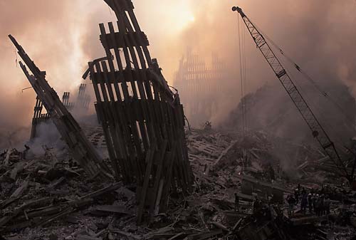
8.Why did Joel Meyerowitz photograph ground zero in colour?
He captured his imge of Ground Zero in colour because he felt they were in black and white they would remain as a tragedy.
in 1933, Henri Carter Bresson captured a photograph (Behind the Gare-Saint-Lazare) that illuminated photography's potential, which led to the creation of Photojournalism, now one of the most familiar concepts of photography.
2.Should you trust a photograph? (1.38m G3)
People saw iconic images of war as the truth, yet we now question how well the photograph really shown the war and whether it was all myth.
3.What was revolutionary about the Leica in 1925?
The Leica was a quiet, compact and insant camera launched in Germany 1925. It was revolutionary because it allowed a photographer to look through a lens as well as being able to watch the world around it.
4.What did George Bernard Shaw say about all the paintings of Christ?
George Bernard Shaw said he would exchange every painting of Christ for ones snapshot.
5.Why were Tony Vaccaros’ negatives destroyed by the army censors?
They contained images of dead G.I's, something that army censors felt the world wasn't ready for.
6.Who was Henryk Ross and what was his job?
Henryk Ross was a polish Photographe as well as a Jew. In the ghetto he was kept in, he was it's offical photographer, responsible for documenting the production of goods made there.
7.Which show was a “sticking plaster for the wounds of the war”, how many people saw it and what “cliché” did it end on?
'The Family of Man' was an exhibition in New York 1955, made up of 500 images from 273 photographers. It attracted 9 million visitors by 1964 and ends with the image by W. Euigene's of his children, giving an optimistic cliche for the future.
8.Why did Joel Meyerowitz photograph ground zero in colour?
He captured his imge of Ground Zero in colour because he felt they were in black and white they would remain as a tragedy.
Saturday, 10 March 2012
The Genius of Moving Image, Part 3
1. How did Bjork and Chris collaborate on the All is full of love video?
Bjork's role in the making of the video was too mimic the robotic position and sing in order for the two to combine. Whilst doing this, Chris would capture stills of this.
2. What techniques were used on the portishead video to create the unusual slow motion effects.? Research this.
For the effect of slow motion, the subjects were shot floating in water. This was then also slowed down dramatically.
3. What other music video directors have gone on to direct feature films? Name two and the feature films they have made.
Jonas Akerland is a Swedish film and music video director, most famous for madonna's 'Ray of Light' video. He has since directed The film Horsemen (2009) and the upcoming Small Apartments (2012)
David Fincher is an American music video and film director who was directed for Madonna, The Rolling Stones and Billy Idol. He has since directed feature films such as The Social Network, Alien 3 and The Girl With the Dragon Tattoo.
4. Which famous sci - fi film did Chris Cunningham’s work on before he became a director?
Cunningham first worked on the film Judge Dredd (1995)
5. What makes his work different or original compared to other similar directors?
The way in which he directs his videos are unique, he is not afraid to take risks, try something out of the ordinary and shock people. I think he also challenges himself every time.
Bjork's role in the making of the video was too mimic the robotic position and sing in order for the two to combine. Whilst doing this, Chris would capture stills of this.
2. What techniques were used on the portishead video to create the unusual slow motion effects.? Research this.
For the effect of slow motion, the subjects were shot floating in water. This was then also slowed down dramatically.
3. What other music video directors have gone on to direct feature films? Name two and the feature films they have made.
Jonas Akerland is a Swedish film and music video director, most famous for madonna's 'Ray of Light' video. He has since directed The film Horsemen (2009) and the upcoming Small Apartments (2012)
David Fincher is an American music video and film director who was directed for Madonna, The Rolling Stones and Billy Idol. He has since directed feature films such as The Social Network, Alien 3 and The Girl With the Dragon Tattoo.
4. Which famous sci - fi film did Chris Cunningham’s work on before he became a director?
Cunningham first worked on the film Judge Dredd (1995)
5. What makes his work different or original compared to other similar directors?
The way in which he directs his videos are unique, he is not afraid to take risks, try something out of the ordinary and shock people. I think he also challenges himself every time.
The Genius of Photography: Part 5
1.Who said “ The camera gave me the license to strip away what you want people to know about you, to reveal what you can’t help people knowing about you”, and when was it said?
Diane Arbus
2.Do photographers tend to prey on vulnerable people?
It has been a controversial subject over the decades on whether photographers prey on vulnerable people. The photographer can either feel empathy and compassion for the subject matter, or simply be driven by their story and to expose them socially, culturally and economically.
3.Who is Colin Wood?
Colin Wood is the subject within Arbus's 'Child with toy hand grenade in Central Park' (1962)
4.Why do you think Diane Arbus committed suicide?
I believe Diane Arbus committed suicide in 1971 because of her lack of self esteem and her insecuries within herself. It was said that whils capturing images of several different people, she was in fact recognising her own insecuries.
5.Why and how did Larry Clark shoot “Tulsa”?
Larry Clark first published the book 'Tulsa' In 1971, in which he gives an insight into his own life involving drugs, sex, violence and gunplay.
6.Try to explain the concept of “confessional photography”, and what is the “impolite genre”?
Confessional photography concerns photographs that show the truth and reality of life, such as intimate scenes people tend to ignore. Impolite genre on the other hand sees such photographs as uncomfortable to look at, casting them as disturbing and shocking.
7.What will Araki not photograph, and why?
Araki captures images of everything around him to help him remember his memories. He said he will only photograph things that he wants to remember.
8.What is the premise of Postmodernism?
The 'premise of postmodernism is that we live in a century that is so filled with media imagery and examples of how people should live their lives that the previous ideas of this has now become a myth.
Diane Arbus
2.Do photographers tend to prey on vulnerable people?
It has been a controversial subject over the decades on whether photographers prey on vulnerable people. The photographer can either feel empathy and compassion for the subject matter, or simply be driven by their story and to expose them socially, culturally and economically.
Colin Wood is the subject within Arbus's 'Child with toy hand grenade in Central Park' (1962)
4.Why do you think Diane Arbus committed suicide?
I believe Diane Arbus committed suicide in 1971 because of her lack of self esteem and her insecuries within herself. It was said that whils capturing images of several different people, she was in fact recognising her own insecuries.
5.Why and how did Larry Clark shoot “Tulsa”?
Larry Clark first published the book 'Tulsa' In 1971, in which he gives an insight into his own life involving drugs, sex, violence and gunplay.
6.Try to explain the concept of “confessional photography”, and what is the “impolite genre”?
Confessional photography concerns photographs that show the truth and reality of life, such as intimate scenes people tend to ignore. Impolite genre on the other hand sees such photographs as uncomfortable to look at, casting them as disturbing and shocking.
7.What will Araki not photograph, and why?
Araki captures images of everything around him to help him remember his memories. He said he will only photograph things that he wants to remember.
8.What is the premise of Postmodernism?
The 'premise of postmodernism is that we live in a century that is so filled with media imagery and examples of how people should live their lives that the previous ideas of this has now become a myth.
Thursday, 8 March 2012
The Genius of Moving Image: Part 1
List two specific key relationships between Sam Taylor Wood's photography and film work?
One obvious relationship between Taylor Wood's photography and moving image work is the subject matter. Both consist purely of people, their characteristics and their emotions. This then leads on to another link between the two mediums, both have narrative to them.
How does the use of multi-screen installation in her work reflect narrative?
Using multi-screen installation allows an audience to view several different narratives that all have different meanings.
What other photographers use film as an integral part of their work. List two with examples?
Adam Chodzko is an British multi-media artist. As well as being a photographer, Chodzko makes installation films much like Taylor Wood's. Work includes The Pickers (2009) and Pyramid (2008).
Research three other Video artists and explain their working philosophy?
1. Shelly Silver is a New York based artist who uses film and photography. Her video work tends to be documentary and experimental, and she uses funny and ironic techniques to lure a viewer in, then tackles serious social issues.
2. Gary Hill is an American video artist and is known as one of the pioneers of video art. He uses a combination of video, text and sound, and experiments with the relationship between human identity, language and the body.
3. Vito Acconci is a New York based designer, architect and installation artist. In the 60's and 70's, Acconci started experimenting with video art using his own body as a subject. He has over the years expanded this into video and audio installations.
Show an example of a specific gallery space or a site specific location where a video artist or film maker has created work specifically for that space and been influenced by it.
The historical landmark 'Petra' in Jordan has been used in several film's and has inspired many scenes in the movies, including Indiana Jones and the Last Crusades.
One obvious relationship between Taylor Wood's photography and moving image work is the subject matter. Both consist purely of people, their characteristics and their emotions. This then leads on to another link between the two mediums, both have narrative to them.
How does the use of multi-screen installation in her work reflect narrative?
Using multi-screen installation allows an audience to view several different narratives that all have different meanings.
What other photographers use film as an integral part of their work. List two with examples?
Adam Chodzko is an British multi-media artist. As well as being a photographer, Chodzko makes installation films much like Taylor Wood's. Work includes The Pickers (2009) and Pyramid (2008).
Research three other Video artists and explain their working philosophy?
1. Shelly Silver is a New York based artist who uses film and photography. Her video work tends to be documentary and experimental, and she uses funny and ironic techniques to lure a viewer in, then tackles serious social issues.
2. Gary Hill is an American video artist and is known as one of the pioneers of video art. He uses a combination of video, text and sound, and experiments with the relationship between human identity, language and the body.
3. Vito Acconci is a New York based designer, architect and installation artist. In the 60's and 70's, Acconci started experimenting with video art using his own body as a subject. He has over the years expanded this into video and audio installations.
Show an example of a specific gallery space or a site specific location where a video artist or film maker has created work specifically for that space and been influenced by it.
The historical landmark 'Petra' in Jordan has been used in several film's and has inspired many scenes in the movies, including Indiana Jones and the Last Crusades.
Friday, 24 February 2012
The Genius of Photography: Part 2
What are Typologies?
Typologies within photography are documentary photographs that prove that something happened or existed. They are used as a recording method.
What was “The Face of the Times”?
"The Face of the Times" were a series of photographs by August Sander. These photographs told the unspoken world of Germany in the 1930's.
Which magazine did Rodchenko design?
in 1920 Rodchenko designed the magazine USSR in Construction. It became an artistic propaganda establishment and gave examples of some of the greatest photo-montage of the 20th century.
What is photo-montage?
Photo-montage is the process of making a whole photograph from cutting and pasting a variety of other photographs, therefore giving a new perspective to the image.
Why did Eugene Atget use albumen prints in the 1920’s?
Eugene Atget was still using albumen prints in the 1920's, a technique created in 1850, simply because he was aware of how to use and develop film from the new equipment that was emerging such as the Leica.
What is solarisation and how was it discovered?
Solarisation is the technique in which a negative is reveresed in tone, meaning the light areas appear dark and the dark appear light.
What was the relationship between Bernice Abbott and Eugene Atget?
Bernice Abbott first met Eugene Atget whilst working for Man Ray. She was inspired by Atget's documentation of the destruction of 'Old Paris'. This eventually led her to return to New York, influenced by Atget's work, and started to capture the ever changing city landscape.
Why was Walker Evans fired from the FSA?
In 1936, Evans was commissioned to photograph share cropper families. Influenced by Atget's work, he captured images that were more artistic and emotional rather that formal, therefore he was eventually fired by the FSA.
Typologies within photography are documentary photographs that prove that something happened or existed. They are used as a recording method.
What was “The Face of the Times”?
"The Face of the Times" were a series of photographs by August Sander. These photographs told the unspoken world of Germany in the 1930's.
Which magazine did Rodchenko design?
in 1920 Rodchenko designed the magazine USSR in Construction. It became an artistic propaganda establishment and gave examples of some of the greatest photo-montage of the 20th century.
What is photo-montage?
Photo-montage is the process of making a whole photograph from cutting and pasting a variety of other photographs, therefore giving a new perspective to the image.
Why did Eugene Atget use albumen prints in the 1920’s?
Eugene Atget was still using albumen prints in the 1920's, a technique created in 1850, simply because he was aware of how to use and develop film from the new equipment that was emerging such as the Leica.
What is solarisation and how was it discovered?
Solarisation is the technique in which a negative is reveresed in tone, meaning the light areas appear dark and the dark appear light.
What was the relationship between Bernice Abbott and Eugene Atget?
Bernice Abbott first met Eugene Atget whilst working for Man Ray. She was inspired by Atget's documentation of the destruction of 'Old Paris'. This eventually led her to return to New York, influenced by Atget's work, and started to capture the ever changing city landscape.
Why was Walker Evans fired from the FSA?
In 1936, Evans was commissioned to photograph share cropper families. Influenced by Atget's work, he captured images that were more artistic and emotional rather that formal, therefore he was eventually fired by the FSA.
Thursday, 23 February 2012
The Genius of Photography: Part 1
What is photography’s “true genius”?
A, The "true genius" of photography is that over 170 years it has gave us many emotions, such as delight, outrage and dissapointment. Yet most importantly, it has intrigued us by showing us what lies beneath the world of appearances.
Name a proto-photographer.
Henry Fox Talbot, known as the main inventor of photography, started photographic experiments in 1834. He first started using paper coated in silver chloride that was sensitive to light. This technique then became down as 'The Calotype' process.
In the 19th century, what term was associated with the daguerreotype?
The term "a mirror with a memory" was used to describe the daguerreotype created by Louis Daguerre. He used a mirror metal plate to create one-off images.
What is the vernacular?
'The Vernacular' is a term used to describe the creation of amateur photography. Mainly unknown photographers would take snapshots of everyday life, capturing common objects, vacations and family and friends.
How do you “Fix the Shadows”?
the problem of 'fixing the shadows' was solved by two rival methods in 1839, paving the way for the practical application of what had previously been an abstract idea.
What is the “carte de visite”?
The 'carte de visite' was a type of small photograph created in Paris by Andre Adolphe Eugene Disderi. He famously used a set of eight separate negatives on one plate. Each photograph was the size of a postcard, and they became very popular to send to family and friends.
Who was Nadar and why was he so successful?
Gaspard-Felix Tournachon, more famously known as 'Nadar' became successful for photographing stars from a different perspective. He captured them as 'equals' and shown their true personality and characteristics.
What is pictorialism?
Pictorialism was a term used to describe a movement of photography that had 'dark', 'moody' and 'thoughtful' characteristics. The movement had a sense of melancholy and nostalgia.
A, The "true genius" of photography is that over 170 years it has gave us many emotions, such as delight, outrage and dissapointment. Yet most importantly, it has intrigued us by showing us what lies beneath the world of appearances.
Henry Fox Talbot, known as the main inventor of photography, started photographic experiments in 1834. He first started using paper coated in silver chloride that was sensitive to light. This technique then became down as 'The Calotype' process.
In the 19th century, what term was associated with the daguerreotype?
The term "a mirror with a memory" was used to describe the daguerreotype created by Louis Daguerre. He used a mirror metal plate to create one-off images.
What is the vernacular?
'The Vernacular' is a term used to describe the creation of amateur photography. Mainly unknown photographers would take snapshots of everyday life, capturing common objects, vacations and family and friends.
How do you “Fix the Shadows”?
the problem of 'fixing the shadows' was solved by two rival methods in 1839, paving the way for the practical application of what had previously been an abstract idea.
What is the “carte de visite”?
The 'carte de visite' was a type of small photograph created in Paris by Andre Adolphe Eugene Disderi. He famously used a set of eight separate negatives on one plate. Each photograph was the size of a postcard, and they became very popular to send to family and friends.
Who was Nadar and why was he so successful?
Gaspard-Felix Tournachon, more famously known as 'Nadar' became successful for photographing stars from a different perspective. He captured them as 'equals' and shown their true personality and characteristics.
What is pictorialism?
Pictorialism was a term used to describe a movement of photography that had 'dark', 'moody' and 'thoughtful' characteristics. The movement had a sense of melancholy and nostalgia.
Wednesday, 14 December 2011
Image and Text...
Image and text individually are two very different things. When we see an image we allow our minds to explore its depth and create our own story of its background. In contrast to this, text is mainly used to inform us of what is happening. However when the two are combined, it can create a new form of art. Adding text to an image can inform an audience, used in advertising for example. It can tell the story behind the photograph, giving our minds a direction to explore the image. The combination of the two can also tackle serious social and political issues. Whatever the task, the addition of text to an image has become an extremely popular art movement and still remains till this day. Another artist that also uses the combination of text and image is Gillian Wearing. As an conceptual artist, she approaches people of the street and asks them to write something on a piece of paper, as part of the collection "Signs that say what you want them to say and not Signs that say what someone else wants you to say". Some of the results give quite an ironic reaction to Wearing's photography, such as an business man being 'desperate' and a policeman asking for 'HELP'. Some other results prove to tackle serious social and political issues of today.
On working on our magazine, we initially knew we had to combine word and image in order to create one. With the idea of using facts about Birmingham but illustrating them in several different ways, we had many opportunities to create unique combinations. One idea was to present a fact in the style of Gillian Wearing's photography, mentioned previously. We chose this technique because it was eye-catching, drawing a reader in. I also chose to capture this shot in this particular setting so the text would relate more to the image. This is another important factor of the combination of the two, each need to relate to each other in order to be successful. Thursday, 24 November 2011
The Experts...
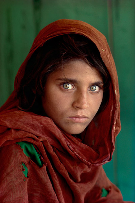
Steve McCurry is an American photojournalist who is universally known as one of today's finest photographers. He has covered several international conflicts such as the Iraq-Iran war, Afghanistan and the Gulf War. What is extremely special and striking about McCurry's work is not only his sheer skill and talent, but they way in which he can captures both human struggle and joy. His images tell magnificent stories and let us as the audience make an automatic connection to the place he is capturing. Without a doubt the most famous image of Steve McCurry's career is 'Afghan Girl' from 1984 (above); It was named "the most recognized photograph" by National Geographic. If in order to become an expert you must receive several acknowledgements and awards, then McCurry has to be considered the best of them all.
Another factor that I feel ranks Steve Mccurry as one of the experts is the commitment and willingness he shows in order to create the image that he wants. When he first entered Afghanistan in 1979, he disguised himself as a local and sewed his film to his clothes in order to cross the border. It was this commitment that produced some of his finest work and won him the Robert Capa Gold Medal for Best Photographic Reporting Abroad. It is also this determination that makes him one of the most inspiring photographers of the decade, and a expert.
To me Steve Mccurry is one of the best photographers of all time. Not only has he won an incredible amount of awards and honours, developed an astonishing skill and technique and is an inspiration to many aspiring photographers, he also manages to connect people around the world through his work. Mccurry loves to capture people from different cultures around the world, however manages to capture the essence of humans that bring each culture together and make us all alike. This skill is a rarity in today's world of photography and one Steve Mccurry has mastered in a way that he has to be considered one of the greatest experts in the field.
Tuesday, 22 November 2011
When and How was the First Ever Book in Europe Printed?...
Where and how the first book was printed is a topic that is still to this day argued about. Some say the Chinese were the first to event such an act, printing images and scriptures of Buddhism. Others say that 'The Diamond Sutra' is the worlds earliest, printed book dating back to 868 and therefore is evidence of the first ever print. However, it was the invention of movable type printing that was seen as the beginning of printing and revolutionized publishing forever. Such an invention, came from the European Johannes Gutenberg.
It was in Strasbourg, Germany in 1440 that Gutenberg first revealed his secret of his printing. In 1448 he had moved to Mainz, Germany in which he took a loan from his brother-in-law, Arnold Gelthus. By 1450, his time perfecting and researching his printing methods were finally unveiled, and his printing press was in operation. Wealthy moneylender Johann Fust and Perer Schoffer were also part of the enterprise. The first actual piece of writing to be printed from Gutenberg was a German poem. However in 1455, Gutenberg released what is now known to be the first ever printed book in Europe; The Gutenberg Bible. There are said to be only 20 complete copies still available till this day, and the text is estimated to be one of the most valuable books in the world.
A complete copy of the Gutenberg Bible has 1,272 pages. 45 copies of the book were printed on vellum, and 135 copies on handmade paper imported from Italy. Gutenberg was also known for developing an oil-based ink that has a high metallic content. In his time, the ink used were mainly water-base and not suitable for such handmade paper.
How Gutenberg discovered 'movable type' is still unclear to experts, but a recent theory reveals he may have created text using a punch, matrix and a mold. A metal punch in which letters are carved into the material and hammered into a copper bar. This is known as a 'matrix'; a mold for a letter. This is then filled with a molten type liquid that sets into a metal almost immediately. After casting, the pieces of type are arranged into type-cases and used to create printed text. This can be repeated hundreds of times, as can the reusable matrix's. They can also be used in any combination, giving it it's name "movable type". This is the most recognised and sensible theory of how Gutenberg developed his technique.
Wednesday, 16 November 2011
Future Film: Digital Storytelling...
Digital storytelling can be defined as the process of advertising and promoting using several different distribution systems and platforms to engage in an audience. For example, an TV programme obviously uses television to advertise, but can also use websites, applications, books, music, billboards, posters, and possibly even film. Because their are time limits on film and TV episodes, creators and designers have used the advance in technology to develop their ideas further. They use such platforms to expand their brand's past such limits.
The phenomenum that is 'Harry Potter' is one of the most successful brand's in the world, and is estimated to be worth as much as $15 billion. The series of Harry Potter started as novels by J.K Rowling, but it is argued that the film adaptations have proved more popular than the original books.
Since the ever growing popularity of both the novel and film series of Harry Potter, the brand has used several platforms to continue such success. One of the first platforms used was the gaming industry, overall the novels and films have spurned out eight video games. The game adaptations have proven extremely successful too, using companies such as Wii, PlayStation, Xbox and Microsoft to advertise such games. This allows an audience who are not so keen on the novels or film adaptations to somewhat take control of the characters and get lost in a fantasy world. It has also allowed the designers and creators of Harry Potter to share more of their successful ideas and expand visually.
This success of this platform has now led to the licensing of more than 400 Harry Potter products. This include Ipods, watches, board games, action figures and even the new Harry Potter Land.
The phenomenum that is 'Harry Potter' is one of the most successful brand's in the world, and is estimated to be worth as much as $15 billion. The series of Harry Potter started as novels by J.K Rowling, but it is argued that the film adaptations have proved more popular than the original books.
This success of this platform has now led to the licensing of more than 400 Harry Potter products. This include Ipods, watches, board games, action figures and even the new Harry Potter Land.
Story Development: Three Act Structure...
The 'Three-act structure' is a modern theory that is used in writing stories that can be applied to novels, films, plays and television programmes. It divides the screenplay into three parts, the 'Set-up', 'Confrontation', and 'Resolution'.
In other words, we are introduced to the characters and the storyline, there is a crisis that hits them, then the crisis is resolved.
In order to be able to fully understand the Three-act structure, I have applied the theory to a recent film called 'Friends with Benefits'. This film was realised in July 2011 and is an American romantic comedy. It can be argued that "rom-com's" as they are known, have always been a great example of the Three-act structure because each film is quite similar in their plots. I will identify each act in the film and explain how it is successful and why it is used.
The first act, the 'Set-up' is used to introduce and establish the main characters and the situations they are living in. We are introduced to Jamie and Dylan, both have similar outlooks on life and both have just come out of relationships. After Jamie recruits Dylan to her magazine company, they become good friends and come to the conclusion that sex should not come with so many attachments. In this decision, they then agree to have a 'no strings attached' relationship. This signifies the on-screen incident that confronts both main characters. After this decision, Jamie and Dylan start to develop emotional feelings for each other after sharing a intimate night together whilst visiting Dylan's family.
This decision to do this relates to the previous confrontation of their break-up with other people, and is known as the 'inciting incident/the first turning point'. This acts as a catalyst for the story, signifies the end of the first act and the beginning of the 'Confrontation'.
The third and final act of this three-part structure, the 'Resolution', is where all the main questions and dramatic incidents are answered. Jamie and Dylan come face-to-face, known as 'The Climax' or 'The second turning point' and is the scene where all the tensions of the story are brought to a head. With his new found self-awareness, Dylan romantically apologises to Jamie with several gestures that are personal to her, he confesses his feelings and she forgives him. Their problems are resolved, and the characters return to their equilibrium that they were previously in in the first act.
Sunday, 6 November 2011
Testing your Work...
There are many ways of letting people know about your work. Whether you choose to display your work in a gallery, on a blog, or on the streets of London, the context and the message of your work needs to be considered. It is essential to target the right type of audience and to think about what is suitable.
The graffiti artist Banksy is well known for his controversial, bold work, but is arguably more known for his art pieces being publicized on the streets of the UK.
Banksy made a very bold decision when deciding to publish his work in such a way, some of his work could be considered to be inappropriate to some ages and genders. Yet Banksy took this risk, and was right in doing so. The majority of his work, although on the basis looks humorous, actually imposes a serious, metaphorical message. The top image that I have presented holds the message 'nation under CCTV'. The fact that this piece is in the mist of the community of London emphasizes this message more. If the piece was exhibited in a gallery for example, it would not have such a dramatic effect.
Thursday, 3 November 2011
Interpretation...
The way in which a piece of art is interpretated by an artist can depend on the time in which the piece is made. For example, a picture of a woman in the 1920's is bound to be different to one taken in the 1950's, because of the new found independence women found in such an era. What is happening at the time of making a piece of art can have a great influence on the end product. Events such as war can actually form a new movement of art, poets from 1914 started to focus their writing on the impact it was having. Artists can use the 'Zeitgeist' of their time to interpret the content of their work.
An original piece of art can be repeated through history, and as previously said, can be affected by the generation it has been brought in to. As a visual communicator, it is extremely important that we understand the historical context of a piece of art and how it shapes its production. If we understand one piece of work from a certain era, we then can recognize other pieces of art that are effected by the same movement. We can also then understand why we sometimes produce work in a certain way and be aware that our social context has an effect on us.
To the right is one of five images from the collection 'The Cottingley Fairies' taken in 1917. Believe it or not, nearly 100 years ago people believed in the existence of fairies. There was much controversy and speculation over these images. It is said that one of the main reasons these photographs were taken were to let the audience escape from the reality of World War I. The photographer here has used the Zeitgeist of her time to create an interpretation of the series of photographs.
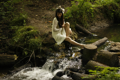
To the right is an example of how an artist has used 'The Cottingley Fairies' as inspiration and created their own interpretation of the piece.
This idea of the existence of fairies is now being used as a fashion statement, and the 'floaty', 'innocent' sense of a fairy is now influencing several fashion lines.
The photographer has used the zeitgiest of her time in order to create this artistic shoot. In the 21st century, we are all well aware that fairies do not exist, and the belief of such things has almost been mocked by artists and designers. They have found a new interpretation.
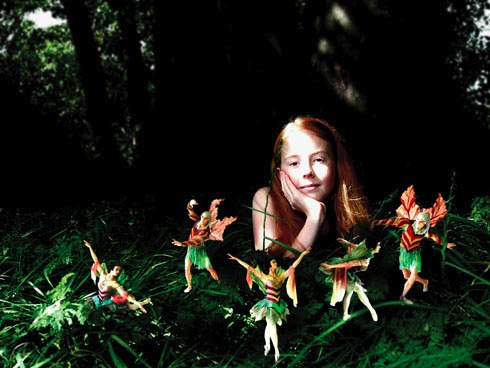
Again we see a photograph that has been inspired by the 'Cottingley Fairies' made in 1917. This image was again made in the 21st century and can also be said to be a fashion shot. The making of this image and the editing could also be said to be influenced by the zeitgiest of the artist's time. The 'psychedelic' colours of the fairies and the obvious unreality of them are very much in contrast to the original image. This could be represented the knowledge that we have in the 21st century that such creatures don't exist. The high use of editing and the pristine quality of the image could be representing our vast amount of technology and understanding of the world, much in contrast to when the original Cottingley Fairies was made.
To the right is one of five images from the collection 'The Cottingley Fairies' taken in 1917. Believe it or not, nearly 100 years ago people believed in the existence of fairies. There was much controversy and speculation over these images. It is said that one of the main reasons these photographs were taken were to let the audience escape from the reality of World War I. The photographer here has used the Zeitgeist of her time to create an interpretation of the series of photographs.
This idea of the existence of fairies is now being used as a fashion statement, and the 'floaty', 'innocent' sense of a fairy is now influencing several fashion lines.
Again we see a photograph that has been inspired by the 'Cottingley Fairies' made in 1917. This image was again made in the 21st century and can also be said to be a fashion shot. The making of this image and the editing could also be said to be influenced by the zeitgiest of the artist's time. The 'psychedelic' colours of the fairies and the obvious unreality of them are very much in contrast to the original image. This could be represented the knowledge that we have in the 21st century that such creatures don't exist. The high use of editing and the pristine quality of the image could be representing our vast amount of technology and understanding of the world, much in contrast to when the original Cottingley Fairies was made.
Tone of Voice...
In Visual Communication, everything has a tone of voice. From photography, typography, illustration and graphic design, every area tackles this area. It is important that every piece of work is properly connecting to the audience and that it is projecting the right message.
Our eyes come across different types of font every
day, and most of it has been properly designed to give the right message. As visual communicators, we are especially aware of how this has been made and experimented with to create the right statement. A great example of showing how a tone of voice is created is to juxtapose two words and show how presenting them differently can change their meaning. To the right I have made an example of this. The word 'bang' is very onomatopoeic, and the right font has to be chosen to show this. The first font works much better than the second one, I have purposely chosen a clear text emphasised by the boldness and the exclamation marks. However, the second font works much better for a work such as 'sssh', the opposite of bang. The font is very smooth and quite peaceful in itself, which works well for a word such as 'sssh' or 'quiet'. Each word has its own tone of voice and it is down to visual designers to chose the correct font to make this tone clear to an audience.
Experimenting with different typefaces and their tones of voice has been happening since people started to use it for advertising purposes. In doing so, certain typefaces have become known for advertising specific brands. Plain, legible fonts such as Arial, Times New Roman and Verdana have be used for giving serious information. Documents such as application forms, cv's, letters, bills etc all use such fonts because they are clear and straight to the point. When we see such fonts around us, we recognize them as being formal, factual and informing us of some information.
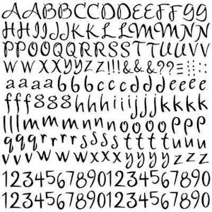
Quite the opposite to this, some fonts ooze a sense of fun and playfulness. To the left is an example of such text. Fonts like these are taken less seriously by a reader, and we recognise them to be advertising something naive, child-like and fun entertainment. Fonts that have been used over generation now automatically have their own tone of voice. We now as visual communicators recognise such patterns and use the correct typefaces for the correct brand.
Images also have a tone of voice, but are not so as apparent as text and fonts.
This is a snapshot from a advert for, surprisingly, the Volvo XC90. Much opposed to a mechanical, man made car, the tone of voice in this image is very peaceful, tranquil and 'dream-like'. This particular setting has purposely been chosen in order to reflect such a feeling. It is actually the juxtaposition of the car and this setting that is it selling point. The photographer has allowed the person's mind to explore the image and picture themselves in such a place. the catch is, they need to buy the car first!
Our eyes come across different types of font every
day, and most of it has been properly designed to give the right message. As visual communicators, we are especially aware of how this has been made and experimented with to create the right statement. A great example of showing how a tone of voice is created is to juxtapose two words and show how presenting them differently can change their meaning. To the right I have made an example of this. The word 'bang' is very onomatopoeic, and the right font has to be chosen to show this. The first font works much better than the second one, I have purposely chosen a clear text emphasised by the boldness and the exclamation marks. However, the second font works much better for a work such as 'sssh', the opposite of bang. The font is very smooth and quite peaceful in itself, which works well for a word such as 'sssh' or 'quiet'. Each word has its own tone of voice and it is down to visual designers to chose the correct font to make this tone clear to an audience.Experimenting with different typefaces and their tones of voice has been happening since people started to use it for advertising purposes. In doing so, certain typefaces have become known for advertising specific brands. Plain, legible fonts such as Arial, Times New Roman and Verdana have be used for giving serious information. Documents such as application forms, cv's, letters, bills etc all use such fonts because they are clear and straight to the point. When we see such fonts around us, we recognize them as being formal, factual and informing us of some information.
Images also have a tone of voice, but are not so as apparent as text and fonts.
This is a snapshot from a advert for, surprisingly, the Volvo XC90. Much opposed to a mechanical, man made car, the tone of voice in this image is very peaceful, tranquil and 'dream-like'. This particular setting has purposely been chosen in order to reflect such a feeling. It is actually the juxtaposition of the car and this setting that is it selling point. The photographer has allowed the person's mind to explore the image and picture themselves in such a place. the catch is, they need to buy the car first!
Legibility...
In order for a piece of work to be truly legible, it needs to be clearly understood, discovered and in the case of a piece of text, capable of being read. Most typefaces and font are firstly created in order to create a statement and stand out from the crowd, to provide a message to an audience or even to create a specific sense or spirit. Despite a typeface doing such things, it always needs to be legible, and some certain fonts can lack in this.
So what makes any typefaces clear and legible? much opposed to the idea of standing out, most legible fonts are actually looked over and unnoticeable to a reader; they don't attract unnecessary attention to themselves. Legible texts are not excessive in options such as boldness, lightness, being underlined or italic. Yet despite this, they tend to still always hold their own specific style and structure through their simplistic design.
To the right I have made my own example of some typefaces to compare what makes either one legible or not legible. To compare each typeface we need to keep in mind what the message is of the text, in this case it is promoting the idea of fashion. The first font is very undoubtably noticable to a reader, yet its boldness and actual style could be seen to be quite childish or quite tacky. The second option however is very elegant in its actual shape and style, and promotes fashion excellently. Also, it does make such a bold statement as the previous typeface, and is very aesthetically pleasing to the eye.
Another important factor of whether a piece of information is legible or not the image that is it illustrating. This poses the question, is text needed in order for a piece of work to be understood?
This anti-smoking advert is obviously very striking and controversial. It is an effective image in the sense that it attracts attention, but without the text would it really be understood? It is not clear to see what the message is without the input of the text that states "The average smoker needs over five thousand cigarettes, get unhooked." With the addition of the text the piece of work is overall very legible and easy to understand.
Despite this, text is not needed in order for something to be legible. The NHS advert on the left is also from an anti-smoking campaign and is promoting a similar message. However, it is quite clear what the message of this advert is without actually reading the text because of how it is presented. The unborn baby shaped is shaped by smoke, and automatically we link this to a person smoking when pregnant. The text above the image makes this clear to us, but as an audience we are automatically drawn to the image and are aware of what it is saying. Perhaps the designers of this advert are aware of this and have purposely made the text extremely small. This is a great example of a piece of work being legible without the typeface being the main attraction.
Another important factor of whether a piece of information is legible or not the image that is it illustrating. This poses the question, is text needed in order for a piece of work to be understood?
This anti-smoking advert is obviously very striking and controversial. It is an effective image in the sense that it attracts attention, but without the text would it really be understood? It is not clear to see what the message is without the input of the text that states "The average smoker needs over five thousand cigarettes, get unhooked." With the addition of the text the piece of work is overall very legible and easy to understand.
Despite this, text is not needed in order for something to be legible. The NHS advert on the left is also from an anti-smoking campaign and is promoting a similar message. However, it is quite clear what the message of this advert is without actually reading the text because of how it is presented. The unborn baby shaped is shaped by smoke, and automatically we link this to a person smoking when pregnant. The text above the image makes this clear to us, but as an audience we are automatically drawn to the image and are aware of what it is saying. Perhaps the designers of this advert are aware of this and have purposely made the text extremely small. This is a great example of a piece of work being legible without the typeface being the main attraction.
Subscribe to:
Posts (Atom)