Thursday 24 November 2011

The Experts...

What does it take for someone to be considered an expert at what they do? Is it that they are wise and knowledgeable, that they are reliable and educating, or is it purely because of their skill and technique? Another question is, how does a person rise from 'a novice' in their profession to be considered an 'expert'. The answer, is practice. Experts are considered to have an intense, ongoing experience in what they do, and some people are only considered true experts through receiving specific acknowledgements or qualifications. Like the saying goes, practice makes perfect. But others like to argue that a person is an expert in their eyes because their work and they as a person are truly inspiring and magnificent to the eye. As a photography student it is part of my course to learn from experts and professionals in the field. I feel I need to be inspired by ones work in order to learn and develop my own skills. Since starting to learn about photography, I have come across many photographers and artists, yet one photographer has always stuck out to me and has truly inspired me into becoming a photo-journalist. That photographer is Steve McCurry. 


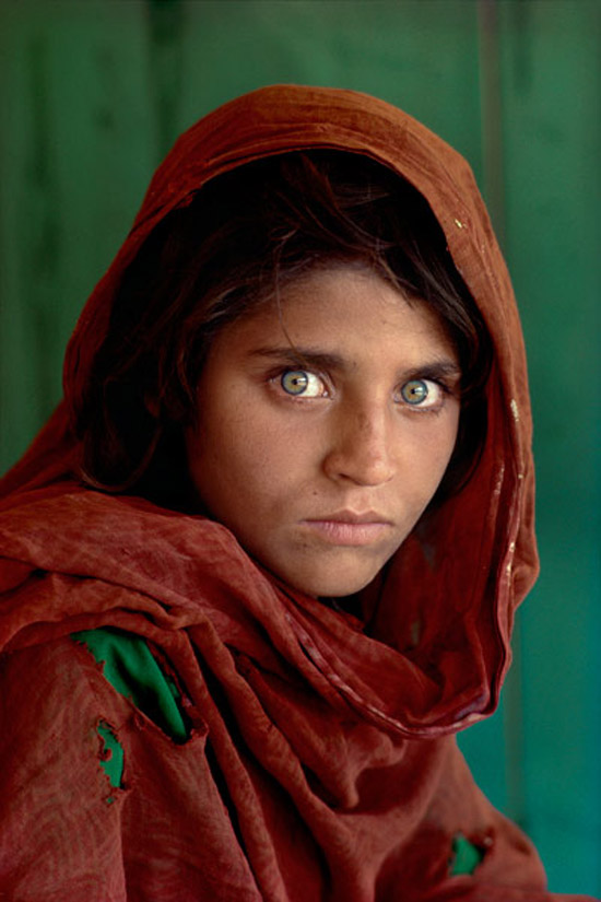
Steve McCurry is an American photojournalist who is universally known as one of today's finest photographers. He has covered several international conflicts such as the Iraq-Iran war, Afghanistan and the Gulf War. What is extremely special and striking about McCurry's work is not only his sheer skill and talent, but they way in which he can captures both human struggle and joy. His images tell magnificent stories and let us as the audience make an automatic connection to the place he is capturing. Without a doubt the most famous image of Steve McCurry's career is 'Afghan Girl' from 1984 (above); It was named "the most recognized photograph" by National Geographic. If in order to become an expert you must receive several acknowledgements and awards, then McCurry has to be considered the best of them all. 
Another factor that I feel ranks Steve Mccurry as one of the experts is the commitment and willingness he shows in order to create the image that he wants. When he first entered Afghanistan in 1979, he disguised himself as a local and sewed his film to his clothes in order to cross the border. It was this commitment that produced some of his finest work and won him the Robert Capa Gold Medal for Best  Photographic Reporting Abroad. It is also this determination that makes him one of the most inspiring photographers of the decade, and a expert. 
To me Steve Mccurry is one of the best photographers of all time. Not only has he won an incredible amount of awards and honours, developed an astonishing skill and technique and is an inspiration to many aspiring photographers, he also manages to connect people around the world through his work. Mccurry loves to capture people from different cultures around the world, however manages to capture the essence of humans that bring each culture together and make us all alike. This skill is a rarity in today's world of photography and one Steve Mccurry has mastered in a way that he has to be considered one of the greatest experts in the field.


Tuesday 22 November 2011

When and How was the First Ever Book in Europe Printed?...

Where and how the first book was printed is a topic that is still to this day argued about. Some say the Chinese were the first to event such an act, printing images and scriptures of Buddhism. Others say that 'The Diamond Sutra' is the worlds earliest, printed book dating back to 868 and therefore is evidence of the first ever print. However, it was the invention of movable type printing that was seen as the beginning of printing and revolutionized publishing forever. Such an invention, came from the European Johannes Gutenberg.  
It was in Strasbourg, Germany in 1440 that Gutenberg first revealed his secret of his printing. In 1448 he had moved to Mainz, Germany in which he took a loan from his brother-in-law, Arnold Gelthus. By 1450, his time perfecting and researching his printing methods were finally unveiled, and his printing press was in operation. Wealthy moneylender Johann Fust and Perer Schoffer were also part of the enterprise. The first actual piece of writing to be printed from Gutenberg was a German poem.  However in 1455, Gutenberg released what is now known to be the first ever printed book in Europe; The Gutenberg Bible. There are said to be only 20 complete copies still available till this day, and the text is estimated to be one of the most valuable books in the world. 
A complete copy of the Gutenberg Bible has 1,272 pages. 45 copies of the book were printed on vellum, and 135 copies on handmade paper imported from Italy. Gutenberg was also known for developing an oil-based ink that has a high metallic content. In his time, the ink used were mainly water-base and not suitable for such handmade paper. 
How Gutenberg discovered 'movable type' is still unclear to experts, but a recent theory reveals he may have created text using a punch, matrix and a mold. A metal punch in which letters are carved into the material and hammered into a copper bar. This is known as a 'matrix'; a mold for a letter. This is then filled with a molten type liquid that sets into a metal almost immediately. After casting, the pieces of type are arranged into type-cases and used to create printed text. This can be repeated hundreds of times, as can the reusable matrix's. They can also be used in any combination, giving it it's name "movable type". This is the most recognised and sensible theory of how Gutenberg developed his technique. 

Wednesday 16 November 2011

Future Film: Digital Storytelling...

Digital storytelling can be defined as the process of advertising and promoting using several different distribution systems and platforms to engage in an audience. For example, an TV programme obviously uses television to advertise, but can also use websites, applications, books, music, billboards, posters, and possibly even film. Because their are time limits on film and TV episodes, creators and designers have used the advance in technology to develop their ideas further. They use such platforms to expand their brand's past such limits. 
The phenomenum that is 'Harry Potter' is one of the most successful brand's in the world, and is estimated to be worth as much as $15 billion. The series of Harry Potter started as novels by J.K Rowling, but it is argued that the film adaptations have proved more popular than the original books. 
Since the ever growing popularity of both the novel and film series of Harry Potter, the brand has used several platforms to continue such success. One of the first platforms used was the gaming industry, overall the novels and films have spurned out eight video games. The game adaptations have proven extremely successful too, using companies such as Wii, PlayStation, Xbox and Microsoft to advertise such games. This allows an audience who are not so keen on the novels or film adaptations to somewhat take control of the characters and get lost in a fantasy world. It has also allowed the designers and creators of Harry Potter to share more of their successful ideas and expand visually. 
This success of this platform has now led to the licensing of more than 400 Harry Potter products. This include Ipods, watches, board games, action figures and even the new Harry Potter Land. 


Story Development: Three Act Structure...


The 'Three-act structure' is a modern theory that is used in writing stories that can be applied to novels, films, plays and television programmes. It divides the screenplay into three parts, the 'Set-up', 'Confrontation', and 'Resolution'. 
In other words, we are introduced to  the characters and the storyline, there is a crisis that hits them, then the crisis is resolved. 
In order to be able to fully understand the Three-act structure, I have applied the theory to a recent film called 'Friends with Benefits'. This film was realised in July 2011 and is an American romantic comedy. It can be argued that "rom-com's" as they are known, have always been a great example of the Three-act structure because each film is quite similar in their plots. I will identify each act in the film and explain how it is successful and why it is used.
The first act, the 'Set-up' is used to introduce and establish the main characters and the situations they are living in. We are introduced to Jamie and Dylan, both have similar outlooks on life and both have just come out of relationships. After Jamie recruits Dylan to her magazine company, they become good friends and come to the conclusion that sex should not come with so many attachments. In this decision, they then agree to have a 'no strings attached' relationship. This signifies the on-screen incident that confronts both main characters. After this decision, Jamie and Dylan start to develop emotional feelings for each other after sharing a intimate night together whilst visiting Dylan's family. 
This decision to do this relates to the previous confrontation of their break-up with other people, and is known as the 'inciting incident/the first turning point'. This acts as a catalyst for the story, signifies the end of the first act and the beginning of the 'Confrontation'.
The second act shows the protagonist's attempt to resolve the problem, only to find themselves making the situation worse. We see these actions in Dylan, he attempts to ignore his developing feelings for Jamie and she overhears him indicating he has no feelings towards her, in which she is hurt. The reason the protagonist cannot resolve the problems that face him is because he or she needs to develop a self-awareness of who they are. We see the character grow and develop, in which co-protagonist's and mentors are there to help such growth. Dylan is mentored by his alzhiemer's stricken father on what is important in life and he then accepts his true feelings towards Jamie.
 The third and final act of this three-part structure, the 'Resolution', is where all the main questions and   dramatic incidents are answered. Jamie and Dylan come face-to-face, known as 'The Climax' or 'The second turning point' and is the scene where all the tensions of  the story are brought to a head. With his new found self-awareness, Dylan romantically apologises to Jamie with several gestures that are personal to her, he confesses his feelings and she forgives him. Their problems are resolved, and the characters return to their equilibrium that they were previously in in the first act. 

Sunday 6 November 2011

Testing your Work...

There are many ways of letting people know about your work. Whether you choose to display your work in a gallery, on a blog, or on the streets of London, the context and the message of your work needs to be considered. It is essential to target the right type of audience and to think about what is suitable. 
The graffiti artist Banksy is well known for his controversial, bold work, but is arguably more known for his art pieces being publicized on the streets of the UK. 
Banksy made a very bold decision when deciding to publish his work in such a way, some of his work could be considered to be inappropriate to some ages and genders. Yet Banksy took this risk, and was right in doing so. The majority of his work, although on the basis looks humorous, actually imposes a serious, metaphorical message. The top image that I have presented holds the message 'nation under CCTV'. The fact that this piece is in the mist of the community of London emphasizes this message more. If the piece was exhibited in a gallery for example, it would not have such a dramatic effect

Thursday 3 November 2011

Interpretation...

The way in which a piece of art is interpretated by an artist can depend on the time in which the piece is made. For example, a picture of a woman in the 1920's is bound to be different to one taken in the 1950's, because of the new found independence women found in such an era. What is happening at the time of making a piece of art can have a great influence on the end product. Events such as war can actually form a new movement of art, poets from 1914 started to focus their writing on the impact it was having. Artists can use the 'Zeitgeist' of their time to interpret the content of their work.
An original piece of art can be repeated through history, and as previously said, can be affected by the generation it has been brought in to. As a visual communicator, it is extremely important that we understand the historical context of a piece of art and how it shapes its production. If we understand one piece of work from a certain era, we then can recognize other pieces of art that are effected by the same movement. We can also then understand why we sometimes produce work in a certain way and be aware that our social context has an effect on us.
To the right is one of five images from the collection 'The Cottingley Fairies' taken in 1917. Believe it or not, nearly 100 years ago people believed in the existence of fairies. There was much controversy  and speculation over these images. It is said that one of the main reasons these photographs were taken were to let the audience escape from the reality of World War I. The photographer here has used the Zeitgeist of her time to create an interpretation of the series of photographs. 
To the right is an example of how an artist has used 'The Cottingley Fairies' as inspiration and created their own interpretation of the piece.
This idea of the existence of fairies is now being used as a fashion statement, and the 'floaty', 'innocent' sense of a fairy is now influencing several fashion lines. 
The photographer has used the zeitgiest of her time in order to create this artistic shoot. In the 21st century, we are all well aware that fairies do not exist, and the belief of such things has almost been mocked by artists and designers. They have found a new interpretation. 
Again we see a photograph that has been inspired by the 'Cottingley Fairies' made in 1917. This image was again made in the 21st century and can also be said to be a fashion shot. The making of this image and the editing could also be said to be influenced by the zeitgiest of the artist's time. The 'psychedelic' colours of the fairies and the obvious unreality of them are very much in contrast to the original image. This could be represented the knowledge that we have in the 21st century that such creatures don't exist. The high use of editing and the pristine quality of the image could be representing our vast amount of technology and understanding of the world, much in contrast to when the original Cottingley Fairies was made.    

Tone of Voice...

In Visual Communication, everything has a tone of voice. From photography, typography, illustration and graphic design, every area tackles this area. It is important that every piece of work is properly connecting to the audience and that it is projecting the right message. 
Our eyes come across different types of font every 
day, and most of it has been properly designed to give the right message. As visual communicators, we are especially aware of how this has been made and experimented with to create the right statement. A great example of showing how a tone of voice is created is to juxtapose two words and show how presenting them differently can change their meaning. To the right I have made an example of this. The word 'bang' is very onomatopoeic, and the right font has to be chosen to show this. The first font works much better than the second one, I have purposely chosen a clear text emphasised by the boldness and the exclamation marks. However, the second font works much better for a work such as 'sssh', the opposite of bang. The font is very smooth and quite peaceful in itself, which works well for a word such as 'sssh' or 'quiet'. Each word has its own tone of voice and it is down to visual designers to chose the correct font  to make this tone clear to an audience.
Experimenting with different typefaces and their tones of voice has been happening since people started to use it for advertising purposes. In doing so, certain typefaces have become known for advertising specific brands. Plain, legible fonts such as Arial, Times New Roman and Verdana have be used for giving serious information. Documents such as application forms, cv's, letters, bills etc all use such fonts because they are clear and straight to the point. When we see such fonts around us, we recognize them as being formal, factual and informing us of some information.
Quite the opposite to this, some fonts ooze a sense of fun and playfulness. To the left is an example of such text. Fonts like these are taken less seriously by a reader, and we recognise them to be advertising something naive, child-like and fun entertainment. Fonts that have been used over generation now automatically have their own tone of voice. We now as visual communicators recognise such patterns and use the correct typefaces for the correct brand. 


Images also have a tone of voice, but are not so as apparent as text and fonts. 
This is a snapshot from a advert for, surprisingly, the Volvo XC90. Much opposed to a mechanical, man made car, the tone of voice in this image is very peaceful, tranquil and 'dream-like'. This particular setting has purposely been chosen in order to reflect such a feeling. It is actually the juxtaposition of the car and this setting that is it selling point. The photographer has allowed the person's mind to explore the image and picture themselves in such a place. the catch is, they need to buy the car first!


Legibility...

In order for a piece of work to be truly legible, it needs to be clearly understood, discovered and in the case of a piece of text, capable of being read. Most typefaces and font are firstly created in order to create a statement and stand out from the crowd, to provide a message to an audience or even to create a specific sense or spirit. Despite a typeface doing such things, it always needs to be legible, and some certain fonts can lack in this. 
So what makes any typefaces clear and legible? much opposed to the idea of standing out, most legible fonts are actually looked over and unnoticeable to a reader; they don't attract unnecessary attention to themselves. Legible texts are not excessive in options such as boldness, lightness, being underlined or italic. Yet despite this, they tend to still always hold their own specific style and structure through their simplistic design.
To the right I have made my own example of some typefaces to compare what makes either one legible or not legible. To compare each typeface we need to keep in mind what the message is of the text, in this case it is promoting the idea of fashion. The first font is very undoubtably noticable to a reader, yet its boldness and actual style could be seen to be quite childish or quite tacky. The second option however is very elegant in its actual shape and style, and promotes fashion excellently. Also, it does make such a bold statement as the previous typeface, and is very aesthetically pleasing to the eye.
Another important factor of whether a piece of information is legible or not the image that is it illustrating. This poses the question, is text needed in order for a piece of work to be understood?
This anti-smoking advert is obviously very striking and controversial. It is an effective image in the sense that it attracts attention, but without the text would it really be understood? It is not clear to see what the message is without the input of the text that states "The average smoker needs over five thousand cigarettes, get unhooked." With the addition of the text the piece of work is overall very legible and easy to understand. 


Despite this, text is not needed in order for something to be legible. The NHS advert on the left is also from an anti-smoking campaign and is promoting a similar message. However, it is quite clear what the message of this advert is without actually reading the text because of how it is presented. The unborn baby shaped is shaped by smoke, and automatically we link this to a person smoking when pregnant. The text above the image makes this clear to us, but as an audience we are automatically drawn to the image and are aware of what it is saying. Perhaps the designers of this advert are aware of this and have purposely made the text extremely small. This is a great example of a piece of work being legible without the typeface being the main attraction. 

Research...

Researching and investigating is an essential part of art and design practice. It is important as a designer, artist or a photographer that we fully understand the project that we decided to involve ourselves with in order to get the best outcome there is.
There are two forms of research, primary and secondary. In primary research, the designer is literally starting from scratch. They have no data given to them, and have to create their own fresh ideas. Secondary research is where the researcher uses specific data and information available, retrieved from other organisations that have done primary research. They use this data as a stepping stone or inspiration for their creative journey.
In terms of a creative person, this research is known as 'visual research'. This can consist of sketching, collecting, reading, photographing and mind mapping. As creative people, we should be constantly surrounding ourselves with stuff that inspires us and be in a ever growing enquiry by doing such things. 
"Notebook after notebook after notebook because I feel sick when I forget potential good ideas..."
A quote from the illustrator, Paul Davis. He is a prime example of an artist doing his own primary research and creating his own inspiration. Despite formally being known an illustrator, he sketches, photographs, collects, writes and prints. Doing such varied work gives an artist a more broad spectrum of inspiration for them. Even if it is not an artist's fortay, they should still be trying different mediums that break them from their comfort zones.
To the left is a print from Paul Davis's notebook that shows great evidence of primary research. He sketches people he sees on the streets and also adds what they say whilst he passes them. This primary research is a great idea for a potential project, and the research he has done has giving him a good amount of work to reflect back on. This primary research is also sure to be the source of secondary research for other designers. Research is an ever growing cycle of inspiration for artists around the world. 
As a photography student, I mainly record inspiration by photographing. I see something that inspires me, photograph it, and reflect back on it at a later date. I also like to sketch a lot. Keeping a notepad and pen is always handy if something unexpected comes along. With these sketches, I also like to annotate them to say what I'd like to do to this certain object, how it is inspiring to me and how I could turn it into another unique piece of work. If I am given a task to complete, I already the basis of what my project is going to be about. I then carry out secondary research in order to find inspiration to expand the project. For example, I am currently working on a magazine based on Birmingham. I firstly started to research different magazines to see how they are presented, and also I explored Birmingham. Here, I have shown examples of secondary research.